Urban Storytellers: How 4cities students visualised data-driven narratives of Vienna
11.10.2014 by ramon bauer
I am privileged to be a lecturer at the 4cities Erasmus Mundus Master Programme in Urban Studies, a 2-year course that takes students to 6 universities in 4 cities (Brussels, Vienna, Copenhagen, Madrid). Last semester I was teaching a new course to this interdisciplinary and ambitious group of international students that deals with data handling, analysis, communication and visualisation – and apparently it was great.
University courses in social sciences that deal with data traditionally have a strong focus on quantitative methods but do not consider how data-based evidence should be communicated, especially to a non-academic audience. Since most academics are not trained in communication, it is hardly surprising that there is a general lack of mind and skill sets to do so. However, graduates of the 4cities Master Programme are working on urban topics in sectors such as urban policy advising, planning, research, teaching, media and arts. Being a professional in these disciplines makes it a necessity to be an urban storyteller. In the digital age, which is also the age of data, a promising way of communicating quantitative information to a wider audience is data visualisation.
Besides data handling and analysis (which is the foundation of quantitative research) the course focused on the meaning of data and how data can be communicated and visualised. Since this is quite a lot for one semester we did not go into great detail, neither theoretically nor methodologically. The aim of the course was rather to enable students with different backgrounds to analyse urban data in order to communicate it visually. Well, considering the students’ feedback as well as my impression on the course, I can clearly say that teaching how to make sense of data and how to communicate quantitative information matters – and it is also rewarding.
To give an idea how the 4cities students approached the task of visualising a data-driven urban narrative of Vienna, find below a selection of projects elaborated during the course. The assignment given was to develop a draft for an interactive data visualisation or to deliver a static infographic (this particular assignment is obviously borrowed from Alberto Cairo‘s MOOC Introduction to Infographics, Data Visualization – a great course, which I attended in 2012). That means it was not required to actually code the interactive parts or to come up with a final design, but rather to elaborate und present a mock-up of the actual data visualisation project that represents the concept, the background of the story and the data used, as well as an idea about the interface functionality and design. For example …
Vienna in Squares – mapping Vienna’s building stock
by Bálint Halász, Elina Kränzle, Hala El Moussawi and Guillén Torres
 A map of Vienna by sub-district level shows the proportions of private-owned residential buildings; a tree map illustrates the distribution by building period. Data source: Open Data Wien
Vienna in Squares is a visualisation that explores the spatial distribution of Vienna’s building stock. A gorgeous map based on squares (hence the title) displays three different levels (city, district, sub-district) along four characteristics (building type, property type, building period, amenities). When elaborated in detail and coded, this draft for an interactive data visualisation would definitely be a great online project alongside other visualisations that cover the characteristics of building stock – for example: Urban Layers, Block by Block – Brooklyn’s Past and Present or Buildings in the Netherlands.
break
Bike Woes Wien – reporting, sharing and mapping pitfalls for cyclists
by Lorena Axinte, Sonja Dragovic, Lucie Rosset and Devon Willis – coded by Bojan Cincur
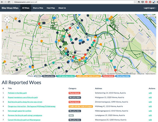 Screenshot from bikewoeswien.com shows all reported woes on a map and also as a list.
Bike Woes Wien is an online platform that enables cyclists in Vienna to share their problems (“woes”). The project goes beyond a static draft for a data visualisation (i.e. the original assignment) and became a full website with an interactive map as a central tool (see also the neat heat map version). The original data comes from RadKummerKasten, an initiative of RadLobby that collected more than 1,000 complaints in Vienna since 2012. The website invites users to report and share their observations and experiences (see also promotion video), which makes Bike Woes Wien and related projects such as You Are Here or Bikenapped great examples for bottom-up initiatives that respond to urban needs and demands.
Vienna’s Underground World – mapping births and deaths along Vienna’s metro lines
by James Furlong, Sandra Jurasszovich, William Otchere-Darko and Maëlys Waiengnier
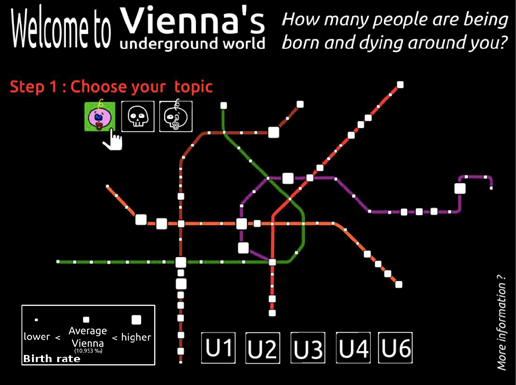 Main screen allows to choose (1) a topic (births, deaths, or natural population balance) and (2) a metro station or line.
Vienna’s Underground World is a project that maps birth and death rates as well as rates of natural increase across the different metro stations and lines of Vienna. The project was inspired by Lives on the Line (showing life expectancy and child poverty in London as a tube map) and by the Inequality and New York’s Subway visualisation. Using data from Open Wien, this project demonstrates the magic of spatial analysis. For example, allocating small-scale population data by proximity to metro lines and stations reveals that there is not a single neighbourhood surrounding the stations of the U1 metro line that exceeds the average birth rate of Vienna (see image below).
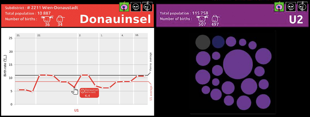 Result for a particular station (left) or for a metro line (right) – originally displayed underneath the main screen – see above. Data source: Open Data Wien
The course was an attempt to make an interdisciplinary group of urban studies students familiar with different quantitative methods (including GIS). The results prove that digging into a data set does not necessarily yield boring results and bored students. Focussing not exclusively on methods but also on the meaning of data and how to communicate it visually seems to be a promising way to spark the interest of students to work with data. I am already looking forward to the next course starting in March 2015.


No comments. Would you like to leave a comment here?